
A Word On Packaging
It’s clean, modern, and simple. But, there’s a few key ideas we’d love to be addressed. Check these out; what do you think?
- The iconography is helpful, but we bet we’d miss it in-store. Consider flipping the city landscape and the iconography. Perhaps even include the icons on package sides since boards are often laid on their sides in store
- What’s “1000 particles per million?” How about communicating this in simple language
- Separate packages for the sensor & boards might get missed in-store. Can they be bundled together or visibly right next to each other?
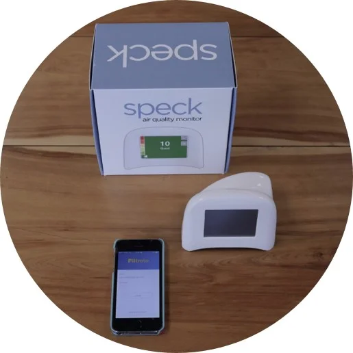
- There’s a disconnect between the sensor and its style of packaging. The sensor’s packaging is Apple-esque, but the sensor itself doesn’t feel high-tech…it’s confusing. Why is the package so deep for such a lightweight, plastic-feeling sensor?
- What if there’s a simple “to open” mark on pack that leads us to the sensor? Tearing open the package is the only way currently, and we’re worried we may inadvertently damage the filter
- The app needs to be more clearly conveyed on-pack; many of us miss or don’t understand “Smart”
- Visual storytelling (on-pack and in-app) of dirty air going in and clean air coming out can provide a quick, powerful call to action
In our own words....
“If I look at the icons, it’s like, ‘wow.’ There’s a lot of them, and so they kind of act as white noise. And they’re pretty cute, almost too cute. What if there were a note next to them that said something like, ‘Protects from….’ in big bold letters so that my eyes are drawn to it?”
In Summary....


