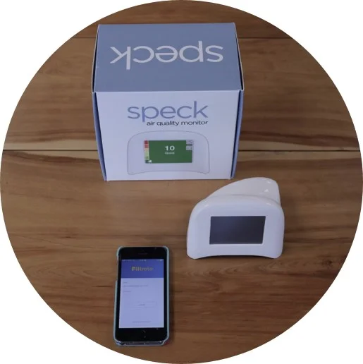

App Data: Useful, But We Could Use Some Help
When we first enter the app’s data pages, we notice that it’s well-laid out, simple, and intriguing. We quickly notice three data points and see that the Indoor air quality is blank. Some of us think it’s because the app is downloading data and that it will show up later. Others of us are plain confused, really wanting to see what our in-home air quality is like. For most of us, it’s the first time we’re seeing this kind of info! We’re not sure what we’d do with it, but we sure are curious! We’d certainly want some education on what all this means and how to best manage our home’s air quality.
In the meantime, here’s a handful of ideas that would help us understand and appreciate the data even more.
- Adding source info to the Outdoor data would ensure trustworthiness
- Trending indoor & outdoor AQ together on the same graph would help make connections easier and give more space on the interface
- Trend data beyond the past 12 hours would help us get a better feel for how to manage our AQ
- Remove the “PM data” as it creates confusion; we think it’s referring to the time of day. How about a “for more info” link instead?
- A library/repository for our various filter sizes would be highly useful
- Many of us don’t change all our filters simultaneously due to costs; a repository that tracks the status of each of our home’s filters would help a great deal
- Having the ability to monitor secondary air filter via single app would also be valued and perhaps open new target audiences (e.g., property managers, those with multiple properties)
- Are all the data points connected? In other words, when it’s time to replace the filter, would my indoor AQ be poor?
- Does outdoor AQ follow you where you go?


